The world's leading automated proofreading software

Reduce Labeling Errors in Your Artwork

Published By:

Mike Baird
12 minutes read
Generic selectors
Exact matches only
Search in title
Search in content
Post Type Selectors

Table of Contents

4 Hidden Risks in Your Labeling Process – Reduce Labeling Errors in your Artwork

Over the years, as we’ve worked to help make proofreading easier and more accurate for our customers, we’ve witnessed many different types of potential issues with labeling artwork design proofs. Most of these issues are visible to the human eye when reading through the document, but a few of them are invisible and require special techniques.
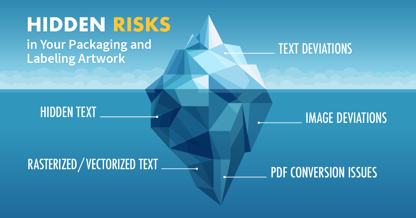
Reduce labeling Errors

Download this Four Hidden Risks in Your Labeling Artwork Infographic as a reference for future projects.

In this article we’ll cover four issues you might find hiding in your labeling artwork:

  1. PDF Conversion Issues
  2. Vectorized / Rasterized Text
  3. Reading-order Issues
  4. Hidden Text

For each labeling issue, you’ll learn what it is, how and why it might arise, how to check for it, and how to prevent errors in the future.

Let’s examine each issue closely.

1) PDF Conversion Issues

Graphic designers use design applications such as Adobe Illustrator and Adobe InDesign to create labeling artwork. These applications are expensive and complex, so it makes sense to convert the designs from the native file format to a more common document format for internal review and also, to send to the printer once the design proof has been approved.

This is where PDFs come in.

PDF stands for “Portable Document Format” and many years ago became the global standard for exchanging documents in a common format. Adobe offers Acrobat Reader for free, and there are even software vendors who offer free software for editing PDF files.

All graphic design applications have a built-in method for converting a design to PDF format.

OK, so what’s the problem?

Problems can arise when the recommended method is not used for exporting to PDF from a given application. In this case, unexpected issues can occur.

Here are just a couple of examples:

  • Corrupt text – Text might look fine when viewing on-screen or hard copy, but could be stripped of Unicode values (unique codes behind the scenes that define each character and are read by many software applications).

  • Missing fonts – If the recommended method for converting to PDF is used, all fonts used in the document will be embedded so that whoever reads the document can see it in its intended form. However, if fonts are not embedded, text could be displayed using the wrong font or might appear simply as unreadable “garbage” characters.

This makes sense, but why should I care?

There’s a laundry list of reasons why, but here are two really good ones:

1. Does your organization have an accessibility policy for leaflets and IFUs? If so, you need to understand that text-to-speech applications don’t read the letters that you and I read on the screen: text-to-speech applications read the Unicode values that are associated with those characters. If your design proof has corrupted text and no longer has any Unicode values connected to the characters on the screen, visually impaired people who want to use a text-to-speech application will be frustrated because their application will interpret that there is no text within the document.

2. Properly embedded fonts are extremely important. If your design proof arrives at the printer without all fonts embedded and the printer does not already have all the fonts that are used in your document, font substitution usually takes place.

The best- case scenario is that the printer notices this has occurred and another correction cycle is necessary. The worst-case scenario? Nobody notices until after the print job is finished and now we have a misprint.

Ouch. – so how do I check for these kinds of issues?

You can check for text corruption by copying the text from your design proof and pasting it into a text editor (e.g. the built-in Notepad application in Windows or the TextEdit application on a Mac with the “Make Plain Text” option enabled). If you can read the text in Notepad and it matches what’s in your design proof, there is no text corruption.

You can also use text-to-speech to have the document read back to you. If text-to-speech works properly, there is no text corruption.

For embedded fonts, you can use Adobe Acrobat (or Acrobat Reader). Go to File / Properties and look at the Fonts tab to see which fonts have been embedded in your document.

Example

Here’s a PDF that has corrupted text. To the human eye everything appears fine:
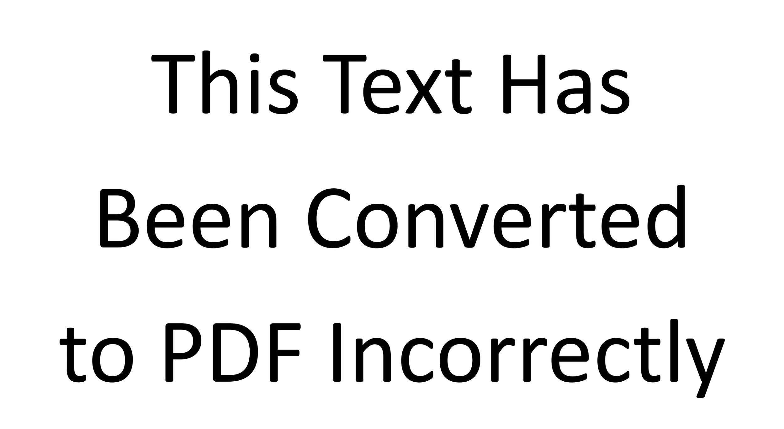
Improperly Exported to PDF.jpg

But here’s what that text looks like when you try to copy / paste it into a text editor:
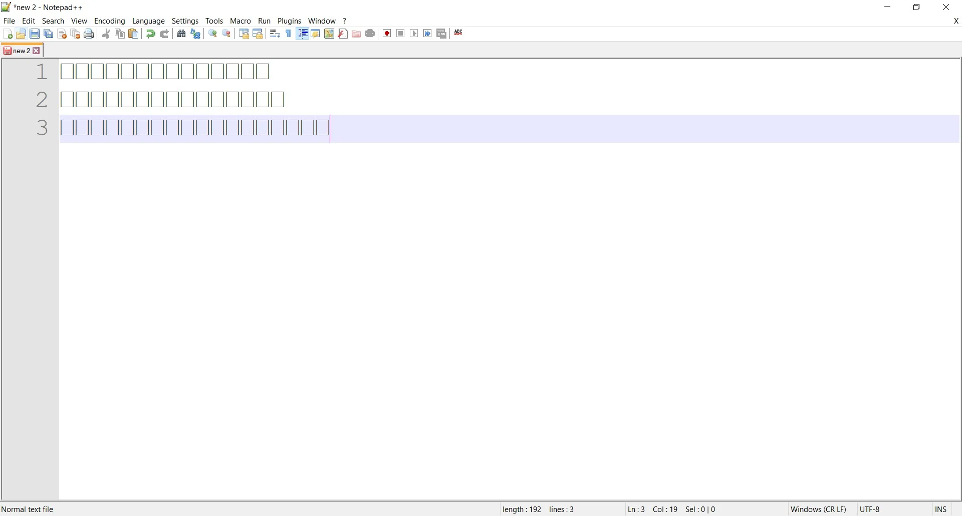
Tofu in Text Editor.jpg

If you’d like to see this for yourself, download this document Improperly Exported to PDF copy the text and paste it into Notepad or another text editing application.

To reduce the amount of work it takes to check for coruption, many organizations use a software such as TVT.

  • To check for text corruption you can use our Text Verification Tool® (TVT) software. In addition to checking for many other types of errors when comparing a design proof to regulatory approved source material, TVT also finds hidden issues such as corrupted text.

  • To check for layout differences TVT offers a full-page image overlay mode so you can see if the layout of the printer’s proof differs from that of your design proof.

How can I prevent these issues from occurring in the first place?

Understand best practices for PDF conversion and the issues that can arise when those best practices are not followed. Each design application has its own recommended method for converting from its native format to PDF. Make sure you adhere to the recommendations for your chosen design application.

Also, consider pre-flighting your PDFs before sending them to the printer. Pre-flighting is an industry term used to define a set of preparedness checks run against a PDF to ensure it is print-ready. Most design applications come with built-in pre-flight functionality, but there are also third-party tools available.

2) Vectorized / Rasterized Text

We’ve already touched on Unicode as a global standard for allowing machines and software applications to accurately read text. Vectorized and rasterized text represent two more ways you might be able to read text on your screen (or hard copy) with your own eyes, but a machine or software application would not be able to read that same text.

Rasterized and vectorized text are slightly different from each other in practice, but for our purposes they both represent the same problem: there is no Unicode behind the characters.

Rasterized Text – This is text that has been completely flattened into an image. Rasterized text is a series of pixels, rather than live text that you can copy from one application and paste into another.

Vectorized Text – This is text that has been partially flattened into shapes that the designer can still manipulate in a design application, but the Unicode values have been removed so these shapes actually do not carry meaning to a computer or machine as text.

No Unicode? This sounds familiar.

Exactly. Removing Unicode from the text in a design proof should only be done when absolutely necessary. Here are some examples of ways that rasterizing / vectorizing the text in your design proofs can cause problems:

1. Accessibility – We covered this in the previous example, but again, if there is no live text in the document, people who are visually impaired will not be able to have the document read aloud to them by a text-to-speech application. If, for example, you’re planning on making any of your documents available, to download from your website, then accessibility should definitely be a consideration.

2. Flexibility – Rasterized / vectorized text usually go hand in hand with a flattening of the document that is supposed to prevent problems once the printer has the design proof. In reality, the flattening of design proofs causes more problems than it solves. Printers sometimes need to make tweaks to a document to get things just right before running the print job. If the document has been flattened, making those tweaks can become difficult or impossible.

3. Can’t use software to proofread – Automated proofreading solutions cannot compare the text of your design proof to your regulatory approved source material, since live text is required for this kind of text comparison.

4. Could get kicked back if submitted to a regulatory body – Regulatory bodies around the world increasingly want to be able to extract text from submitted documents to be part of a searchable index or database. This is not possible if the text in the document has been rasterized or vectorized.

How can I make sure there’s live text in my document?

The same way we checked in the previous example:

  • Try to copy the text into another application, such as Notepad. If you can select text, copy it, and paste it into another application, it’s live text. If it’s rasterized or vectorized text, you won’t be able to highlight the text at all.

  • Open the document in a text-to-speech application. If the document has live text, the text-to-speech application will read the text to you. If not, the application will tell you there’s no text in the document (or it won’t do anything at all since there’s nothing for it to read).

Example

When a document has live text and you try to highlight it, you’ll be able to see the highlights following the lines of text:
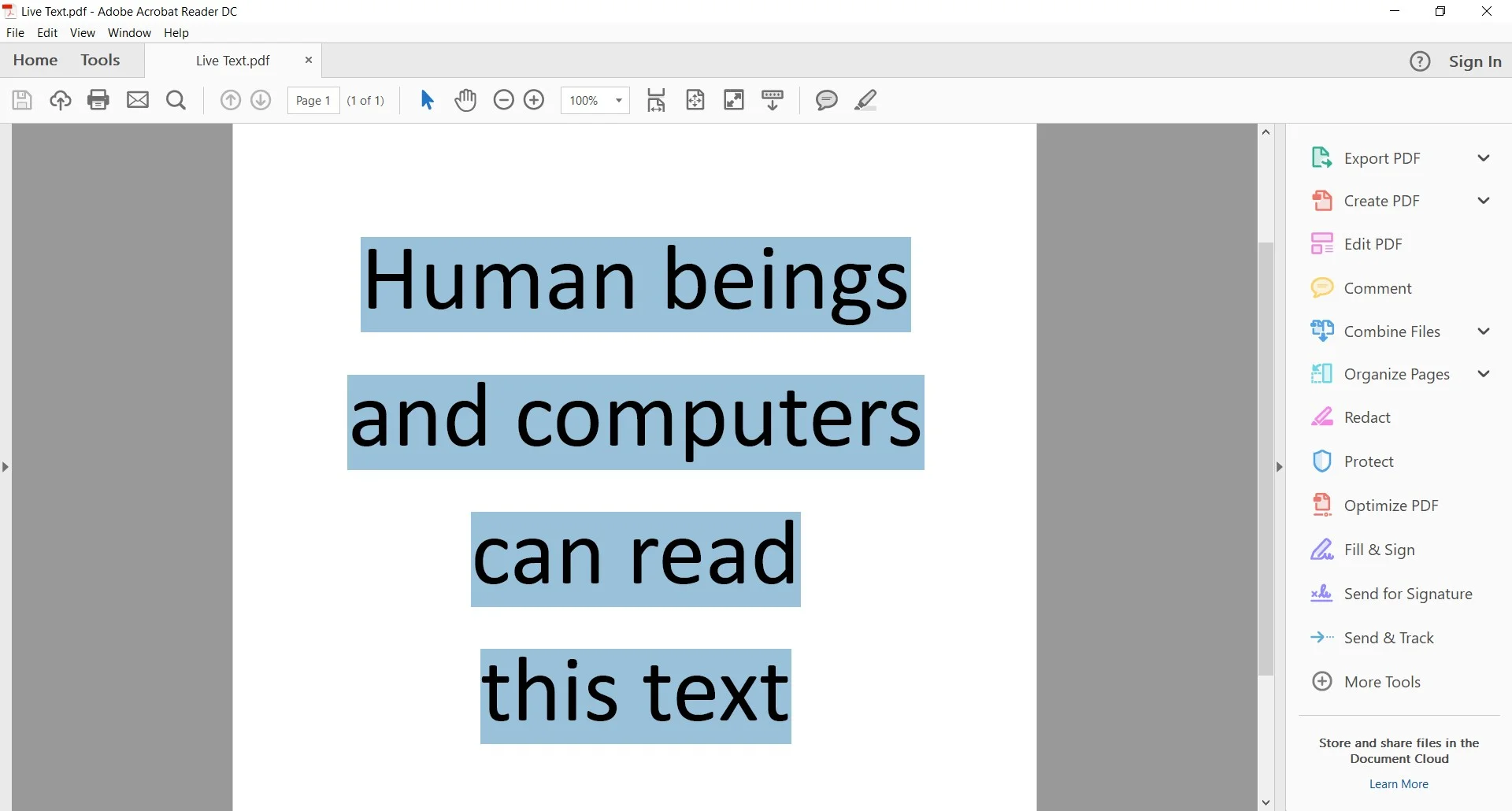
Highlighted Text Humans & Computers can read.jpg

See how the blue highlighting indicates the text has been selected?

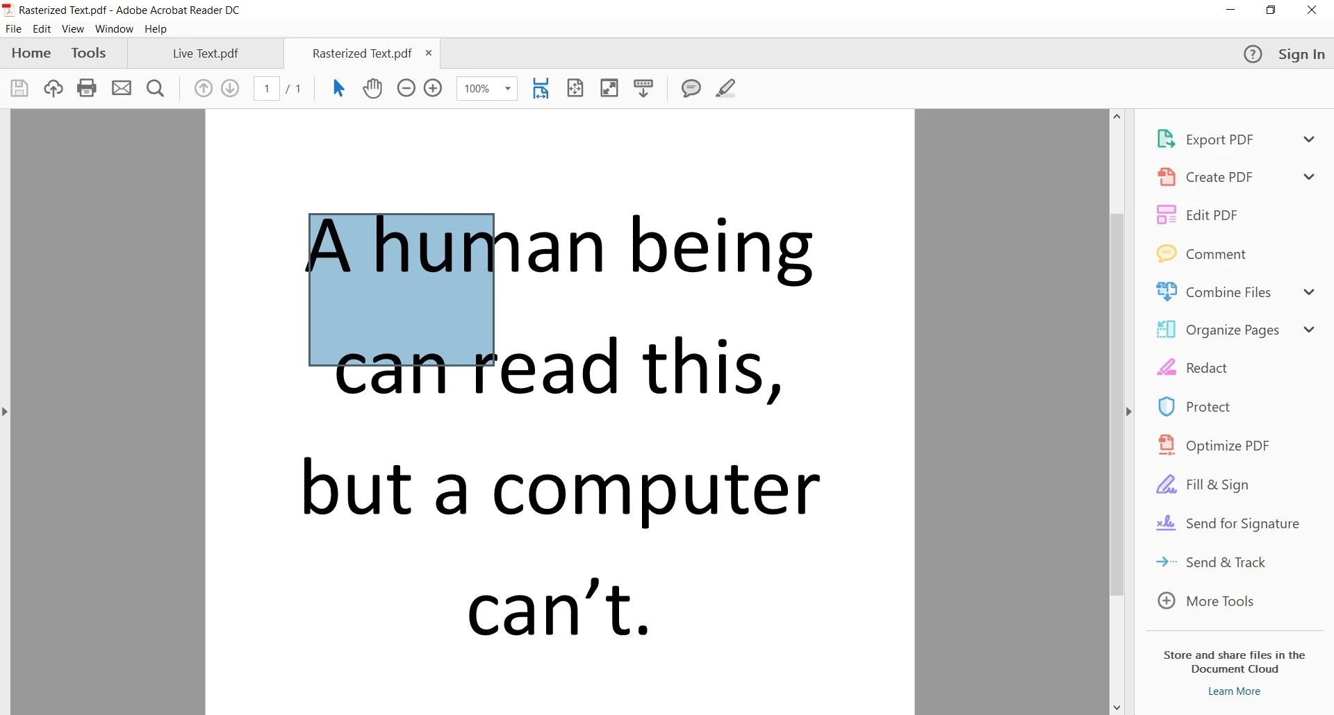
Now let’s look at a document with rasterized text:
Computer cannot read Rasterized Text.jpg

See that blue box? I tried to use my mouse to highlight the text, but there’s no live text to select; instead I get a free-form selection box.

If you’d like to see this for yourself, this document Live Text has live text and you will be able to copy that text into a text editor. This document Rasterized Text does not have live text. It looks like text on the screen, but when you try to highlight the text, you won’t be able to.

Can TVT check for this as well?

Yes! TVT compares the Unicode values of text in one document to the Unicode values of text in another. Therefore, if your design proof has vectorized or rasterized text instead of live text, by using TVT to do your comparison, it’s easy to see there’s a problem.

What’s the best way to prevent these problems from occurring?

Educating your designers and putting standard operating procedures in your labeling process is the best way to ensure your team is following best practices.

This can be a tricky conversation with designers though, because while rasterizing / vectorizing text was a best practice in the past, currently it is not.

A top-notch resource for current best practices on working with PDF files and preparing them for print is the Ghent Workgroup (www.gwg.org). While the Ghent Workgroup is a membership organization, there’s still plenty of valuable free information available on their website.

3) Reading-Order Issues

Ask anyone who’s not a graphic designer and they probably won’t have any idea what “reading-order” means relative to label design proofs.

Design applications don’t function the same way as word processing applications. With a word processor, you would normally open a blank document and simply start typing. While there are ways to introduce reading-order issues with image captions and inserted text boxes, generally the reading order simply starts at the top of the document and flows downward until the end of the document.

In design applications, text always goes in a text box, and these text boxes can get dragged around, reordered, deleted, and added as a design goes through revisions. Each one of these text boxes has a reading-order “tag” and these tags are created in the order that text boxes are created. As a result, if I create four text boxes, then shift them around on the page, my reading-order tags are now out of order.

And this is a problem because?

Accessibility, accessibility, accessibility.

If you’re planning on making this document available to the public, you need to understand that text-to-speech applications will read the text in the order indicated by the reading order tags. The absolute best-case scenario here would be confusion; the worst-case scenario would be some sort of adverse event because of out-of-order instructions in an IFU.

Do I use the same tools to check for these problems as in the previous examples?

Yes!

Copy the text from your design proof and paste it into Notepad. If the text remains in the same order as it is in your design proof, your reading-order is correct. If the text is not in the same order, you’ll need to go back and fix the reading-order tags.

You can also listen to the design proof in a text-to-speech application while following along in the document. If the text is read to you in the same order that it appears in the design proof then your reading order is correct. If the text-to-speech differs from your design proof then you need to fix your reading-order tags.

Example

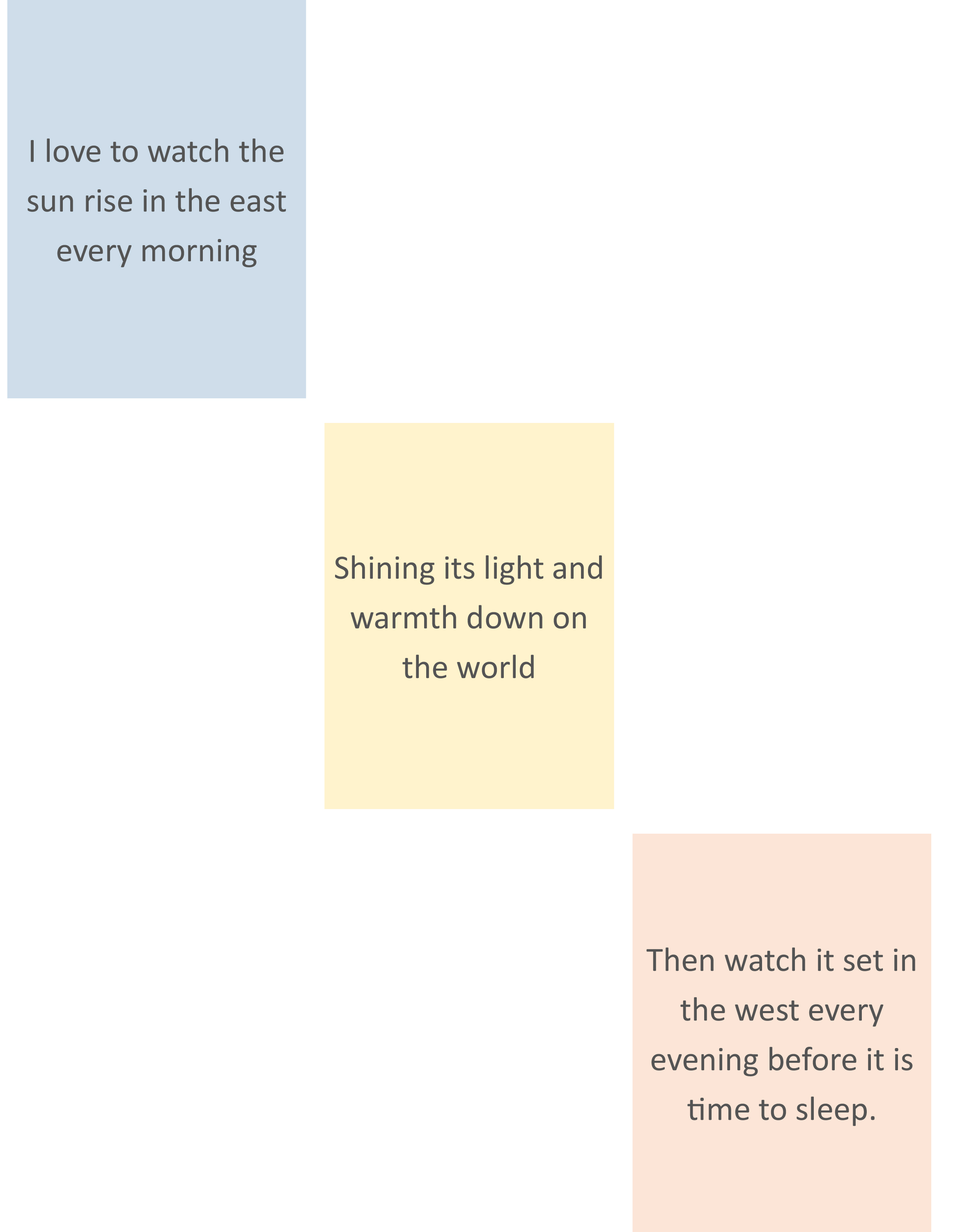
Here’s a PDF with some text that looks like it should read from top to bottom:
Reading Order.jpg

However, when you copy / paste the text into a text editor, the text appears in a different order:

Reading Order - incorrect order.jpg

If you’d like to see this for yourself, download this document Reading-order, copy the text, and paste it into a text editor.

Can TVT help me find reading-order issues?

Yes!

TVT follows the reading order indicated by the reading-order tags, so you’ll know if the reading-order in your source document doesn’t match the reading-order in your artwork.

How can I prevent reading-order issues from occurring?

Make sure your designers know about reading order tags and what tools they have at their disposal to edit / reflow reading order tags (options may vary depending on what design applications they’re using).

It’s also important for designers to know what (if any) policy your organization has on accessibility, and what effect reading-order can have on the accessibility of documents made available to the public.

4) Hidden Text

Hidden text is text that has had its color changed to match the background and is now invisible or text that has been placed behind an image or another text box.

Why would anyone ever hide text in a design proof?

There are times when designers are given difficult or even impossible turnaround times for projects. When this happens they have a bag of shortcut tricks at their disposal to help them get things done faster.

Sometimes it’s easier to hide text and put new text right on top of it than it is to delete and replace it. For example, my medical device company has a MyDevice5000x and a MyDevice5000i where the documentation for one device is a variation of the other. In this case it might seem easier to simply keep the text for both versions on the title page and then hide / make visible whichever one is currently needed.

Let me guess, there are accessibility implications

There are, but hidden text also causes the occasional misprint:

Accessibility – By now we know text-to-speech applications read Unicode, and Unicode has nothing to do with the color of the text. Even white text on a white background will be read out loud by a text-to-speech application. Again, best-case scenario here is confusion; worst-case scenario is an adverse event based on text that’s not supposed to be part of an IFU.

Misprints – As mentioned previously, sometimes the printer will need to make subtle adjustments to a document to get it just right before running the print job. This is especially true for jobs where the paper is not white. Sometimes the color of the text will need to be altered slightly to ensure it looks right on colored paper. When this is necessary, the printer will select an area of text in the document and edit the color.

If any hidden text is part of the selected text, the color of the hidden text will no longer match the color of the background when the printer edits the color, and it will reappear. The best-case scenario is another correction cycle if the printer notices; the worst-case scenario is a misprint if the printer doesn’t.

I think I already know how to check for this.

Yes, you do:

  • Copy / paste the text from your design proof into Notepad. If any additional text appears in Notepad that you can’t see in your design proof, you have hidden text.

  • Listen to the design proof in a text-to-speech application while following along in the document. If what’s read to you matches the document, you don’t have any hidden text. If there’s text read to you that’s not in the design proof, then you do.

Example

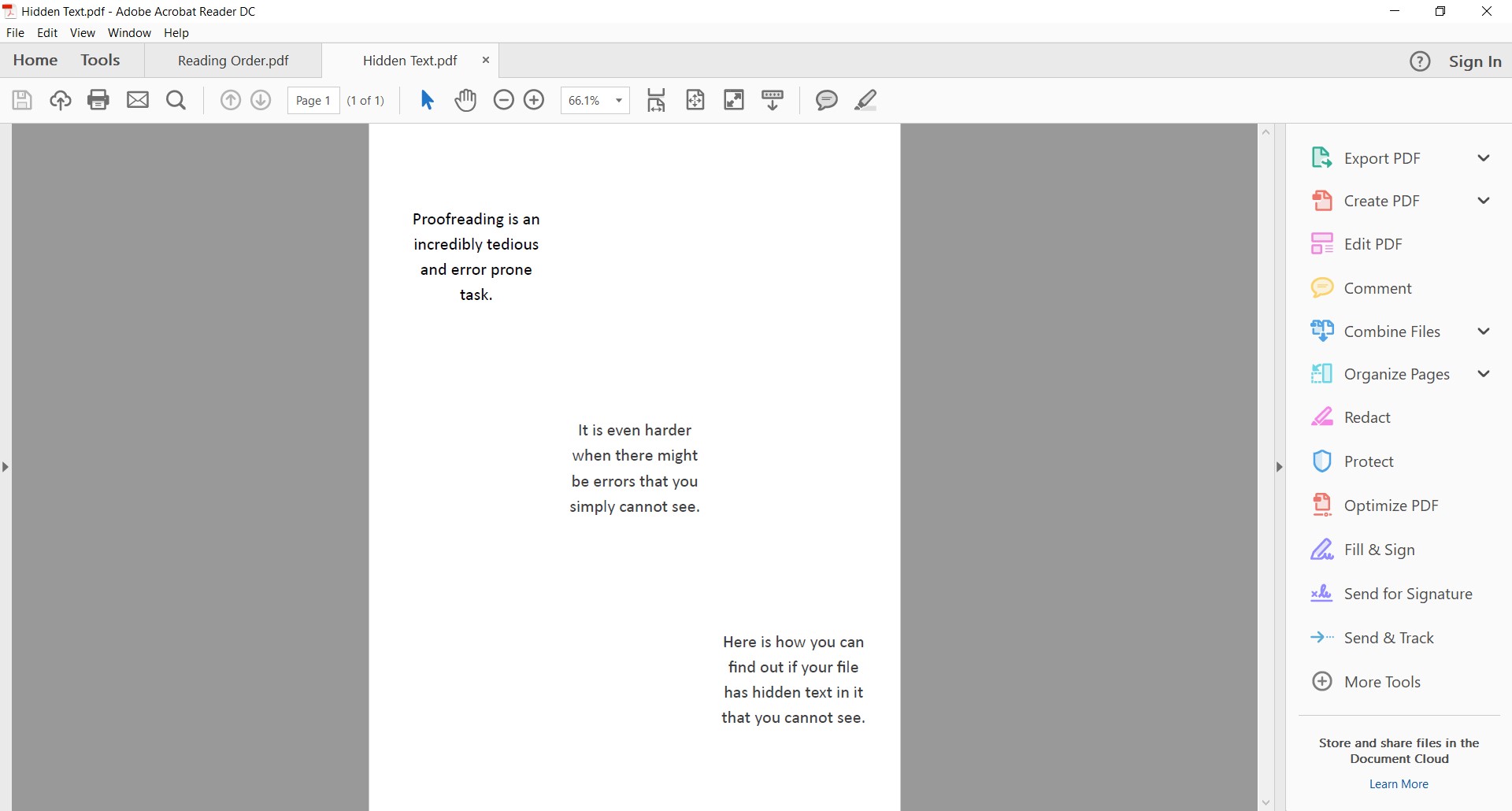
This document appears harmless:
Harmless text example.jpg

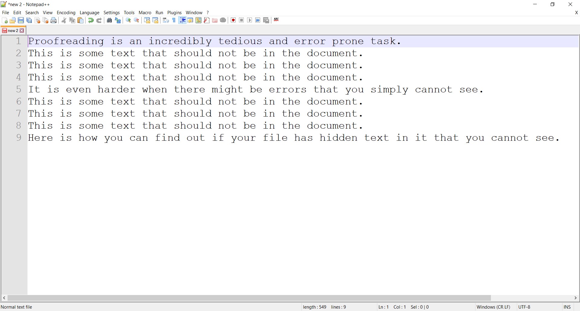
But if you “Select All” (Ctrl A) and then paste into a text editor, there’s now additional text you couldn’t see when looking at the PDF on your screen:
Text that should not be Example.jpg

If you’d like to see this for yourself, download this document Hidden Text, copy the text, and paste it into a text editor.

And TVT can check for this too if I don’t want to do all this manually?

Yes!

Spend less time proofreading while simultaneously increasing the accuracy of your documents. That’s what TVT is all about.

What about prevention?

On one hand, you’ll want to help your designers understand the downstream implications of dipping into their bag of shortcut tricks.

On the other hand, you’ll also want to help your managers understand what can happen when designers are given unreasonable turnaround times for design projects.

Conclusion

The choice is yours whether you want to check for these issues manually or by using a technology solution such as TVT to make proofreading easier and more accurate, but in either case it is imperative to understand the various types of hidden issues that could be present in your labeling artwork design proofs.

Do you want to find out more about how your proofreading life can be easier? Get in touch and we’ll tell you all about it.

Share this article

Mike Baird profile picture

Mike Baird

Director of Product Management, Schlafender Hase

Mike is the Director of Product Management for Schlafender Hase.

Learn More

Subscribe to our blog

4 Hidden Risks in Your Labeling Process – Reduce Labeling Errors in your Artwork

Over the years, as we’ve worked to help make proofreading easier and more accurate for our customers, we’ve witnessed many different types of potential issues with labeling artwork design proofs. Most of these issues are visible to the human eye when reading through the document, but a few of them are invisible and require special techniques.

Reduce labeling Errors

Download this Four Hidden Risks in Your Labeling Artwork Infographic as a reference for future projects.

In this article we’ll cover four issues you might find hiding in your labeling artwork:

  1. PDF Conversion Issues
  2. Vectorized / Rasterized Text
  3. Reading-order Issues
  4. Hidden Text

For each labeling issue, you’ll learn what it is, how and why it might arise, how to check for it, and how to prevent errors in the future.

Let’s examine each issue closely.

1) PDF Conversion Issues

Graphic designers use design applications such as Adobe Illustrator and Adobe InDesign to create labeling artwork. These applications are expensive and complex, so it makes sense to convert the designs from the native file format to a more common document format for internal review and also, to send to the printer once the design proof has been approved.

This is where PDFs come in.

PDF stands for “Portable Document Format” and many years ago became the global standard for exchanging documents in a common format. Adobe offers Acrobat Reader for free, and there are even software vendors who offer free software for editing PDF files.

All graphic design applications have a built-in method for converting a design to PDF format.

OK, so what’s the problem?

Problems can arise when the recommended method is not used for exporting to PDF from a given application. In this case, unexpected issues can occur.

Here are just a couple of examples:

  • Corrupt text – Text might look fine when viewing on-screen or hard copy, but could be stripped of Unicode values (unique codes behind the scenes that define each character and are read by many software applications).

  • Missing fonts – If the recommended method for converting to PDF is used, all fonts used in the document will be embedded so that whoever reads the document can see it in its intended form. However, if fonts are not embedded, text could be displayed using the wrong font or might appear simply as unreadable “garbage” characters.

This makes sense, but why should I care?

There’s a laundry list of reasons why, but here are two really good ones:

1. Does your organization have an accessibility policy for leaflets and IFUs? If so, you need to understand that text-to-speech applications don’t read the letters that you and I read on the screen: text-to-speech applications read the Unicode values that are associated with those characters. If your design proof has corrupted text and no longer has any Unicode values connected to the characters on the screen, visually impaired people who want to use a text-to-speech application will be frustrated because their application will interpret that there is no text within the document.

2. Properly embedded fonts are extremely important. If your design proof arrives at the printer without all fonts embedded and the printer does not already have all the fonts that are used in your document, font substitution usually takes place.

The best- case scenario is that the printer notices this has occurred and another correction cycle is necessary. The worst-case scenario? Nobody notices until after the print job is finished and now we have a misprint.

Ouch. – so how do I check for these kinds of issues?

You can check for text corruption by copying the text from your design proof and pasting it into a text editor (e.g. the built-in Notepad application in Windows or the TextEdit application on a Mac with the “Make Plain Text” option enabled). If you can read the text in Notepad and it matches what’s in your design proof, there is no text corruption.

You can also use text-to-speech to have the document read back to you. If text-to-speech works properly, there is no text corruption.

For embedded fonts, you can use Adobe Acrobat (or Acrobat Reader). Go to File / Properties and look at the Fonts tab to see which fonts have been embedded in your document.

Example

Here’s a PDF that has corrupted text. To the human eye everything appears fine:

Improperly Exported to PDF.jpg

But here’s what that text looks like when you try to copy / paste it into a text editor:

Tofu in Text Editor.jpg

If you’d like to see this for yourself, download this document Improperly Exported to PDF copy the text and paste it into Notepad or another text editing application.

To reduce the amount of work it takes to check for coruption, many organizations use a software such as TVT.

  • To check for text corruption you can use our Text Verification Tool® (TVT) software. In addition to checking for many other types of errors when comparing a design proof to regulatory approved source material, TVT also finds hidden issues such as corrupted text.

  • To check for layout differences TVT offers a full-page image overlay mode so you can see if the layout of the printer’s proof differs from that of your design proof.

How can I prevent these issues from occurring in the first place?

Understand best practices for PDF conversion and the issues that can arise when those best practices are not followed. Each design application has its own recommended method for converting from its native format to PDF. Make sure you adhere to the recommendations for your chosen design application.

Also, consider pre-flighting your PDFs before sending them to the printer. Pre-flighting is an industry term used to define a set of preparedness checks run against a PDF to ensure it is print-ready. Most design applications come with built-in pre-flight functionality, but there are also third-party tools available.

2) Vectorized / Rasterized Text

We’ve already touched on Unicode as a global standard for allowing machines and software applications to accurately read text. Vectorized and rasterized text represent two more ways you might be able to read text on your screen (or hard copy) with your own eyes, but a machine or software application would not be able to read that same text.

Rasterized and vectorized text are slightly different from each other in practice, but for our purposes they both represent the same problem: there is no Unicode behind the characters.

Rasterized Text – This is text that has been completely flattened into an image. Rasterized text is a series of pixels, rather than live text that you can copy from one application and paste into another.

Vectorized Text – This is text that has been partially flattened into shapes that the designer can still manipulate in a design application, but the Unicode values have been removed so these shapes actually do not carry meaning to a computer or machine as text.

No Unicode? This sounds familiar.

Exactly. Removing Unicode from the text in a design proof should only be done when absolutely necessary. Here are some examples of ways that rasterizing / vectorizing the text in your design proofs can cause problems:

1. Accessibility – We covered this in the previous example, but again, if there is no live text in the document, people who are visually impaired will not be able to have the document read aloud to them by a text-to-speech application. If, for example, you’re planning on making any of your documents available, to download from your website, then accessibility should definitely be a consideration.

2. Flexibility – Rasterized / vectorized text usually go hand in hand with a flattening of the document that is supposed to prevent problems once the printer has the design proof. In reality, the flattening of design proofs causes more problems than it solves. Printers sometimes need to make tweaks to a document to get things just right before running the print job. If the document has been flattened, making those tweaks can become difficult or impossible.

3. Can’t use software to proofread – Automated proofreading solutions cannot compare the text of your design proof to your regulatory approved source material, since live text is required for this kind of text comparison.

4. Could get kicked back if submitted to a regulatory body – Regulatory bodies around the world increasingly want to be able to extract text from submitted documents to be part of a searchable index or database. This is not possible if the text in the document has been rasterized or vectorized.

How can I make sure there’s live text in my document?

The same way we checked in the previous example:

  • Try to copy the text into another application, such as Notepad. If you can select text, copy it, and paste it into another application, it’s live text. If it’s rasterized or vectorized text, you won’t be able to highlight the text at all.

  • Open the document in a text-to-speech application. If the document has live text, the text-to-speech application will read the text to you. If not, the application will tell you there’s no text in the document (or it won’t do anything at all since there’s nothing for it to read).

Example

When a document has live text and you try to highlight it, you’ll be able to see the highlights following the lines of text:

Highlighted Text Humans & Computers can read.jpg

See how the blue highlighting indicates the text has been selected?

Now let’s look at a document with rasterized text:

Computer cannot read Rasterized Text.jpg

See that blue box? I tried to use my mouse to highlight the text, but there’s no live text to select; instead I get a free-form selection box.

If you’d like to see this for yourself, this document Live Text has live text and you will be able to copy that text into a text editor. This document Rasterized Text does not have live text. It looks like text on the screen, but when you try to highlight the text, you won’t be able to.

Can TVT check for this as well?

Yes! TVT compares the Unicode values of text in one document to the Unicode values of text in another. Therefore, if your design proof has vectorized or rasterized text instead of live text, by using TVT to do your comparison, it’s easy to see there’s a problem.

What’s the best way to prevent these problems from occurring?

Educating your designers and putting standard operating procedures in your labeling process is the best way to ensure your team is following best practices.

This can be a tricky conversation with designers though, because while rasterizing / vectorizing text was a best practice in the past, currently it is not.

A top-notch resource for current best practices on working with PDF files and preparing them for print is the Ghent Workgroup (www.gwg.org). While the Ghent Workgroup is a membership organization, there’s still plenty of valuable free information available on their website.

3) Reading-Order Issues

Ask anyone who’s not a graphic designer and they probably won’t have any idea what “reading-order” means relative to label design proofs.

Design applications don’t function the same way as word processing applications. With a word processor, you would normally open a blank document and simply start typing. While there are ways to introduce reading-order issues with image captions and inserted text boxes, generally the reading order simply starts at the top of the document and flows downward until the end of the document.

In design applications, text always goes in a text box, and these text boxes can get dragged around, reordered, deleted, and added as a design goes through revisions. Each one of these text boxes has a reading-order “tag” and these tags are created in the order that text boxes are created. As a result, if I create four text boxes, then shift them around on the page, my reading-order tags are now out of order.

And this is a problem because?

Accessibility, accessibility, accessibility.

If you’re planning on making this document available to the public, you need to understand that text-to-speech applications will read the text in the order indicated by the reading order tags. The absolute best-case scenario here would be confusion; the worst-case scenario would be some sort of adverse event because of out-of-order instructions in an IFU.

Do I use the same tools to check for these problems as in the previous examples?

Yes!

Copy the text from your design proof and paste it into Notepad. If the text remains in the same order as it is in your design proof, your reading-order is correct. If the text is not in the same order, you’ll need to go back and fix the reading-order tags.

You can also listen to the design proof in a text-to-speech application while following along in the document. If the text is read to you in the same order that it appears in the design proof then your reading order is correct. If the text-to-speech differs from your design proof then you need to fix your reading-order tags.

Example

Here’s a PDF with some text that looks like it should read from top to bottom:

Reading Order.jpg

However, when you copy / paste the text into a text editor, the text appears in a different order:

Reading Order - incorrect order.jpg

If you’d like to see this for yourself, download this document Reading-order, copy the text, and paste it into a text editor.

Can TVT help me find reading-order issues?

Yes!

TVT follows the reading order indicated by the reading-order tags, so you’ll know if the reading-order in your source document doesn’t match the reading-order in your artwork.

How can I prevent reading-order issues from occurring?

Make sure your designers know about reading order tags and what tools they have at their disposal to edit / reflow reading order tags (options may vary depending on what design applications they’re using).

It’s also important for designers to know what (if any) policy your organization has on accessibility, and what effect reading-order can have on the accessibility of documents made available to the public.

4) Hidden Text

Hidden text is text that has had its color changed to match the background and is now invisible or text that has been placed behind an image or another text box.

Why would anyone ever hide text in a design proof?

There are times when designers are given difficult or even impossible turnaround times for projects. When this happens they have a bag of shortcut tricks at their disposal to help them get things done faster.

Sometimes it’s easier to hide text and put new text right on top of it than it is to delete and replace it. For example, my medical device company has a MyDevice5000x and a MyDevice5000i where the documentation for one device is a variation of the other. In this case it might seem easier to simply keep the text for both versions on the title page and then hide / make visible whichever one is currently needed.

Let me guess, there are accessibility implications

There are, but hidden text also causes the occasional misprint:

Accessibility – By now we know text-to-speech applications read Unicode, and Unicode has nothing to do with the color of the text. Even white text on a white background will be read out loud by a text-to-speech application. Again, best-case scenario here is confusion; worst-case scenario is an adverse event based on text that’s not supposed to be part of an IFU.

Misprints – As mentioned previously, sometimes the printer will need to make subtle adjustments to a document to get it just right before running the print job. This is especially true for jobs where the paper is not white. Sometimes the color of the text will need to be altered slightly to ensure it looks right on colored paper. When this is necessary, the printer will select an area of text in the document and edit the color.

If any hidden text is part of the selected text, the color of the hidden text will no longer match the color of the background when the printer edits the color, and it will reappear. The best-case scenario is another correction cycle if the printer notices; the worst-case scenario is a misprint if the printer doesn’t.

I think I already know how to check for this.

Yes, you do:

  • Copy / paste the text from your design proof into Notepad. If any additional text appears in Notepad that you can’t see in your design proof, you have hidden text.

  • Listen to the design proof in a text-to-speech application while following along in the document. If what’s read to you matches the document, you don’t have any hidden text. If there’s text read to you that’s not in the design proof, then you do.

Example

This document appears harmless:

Harmless text example.jpg

But if you “Select All” (Ctrl A) and then paste into a text editor, there’s now additional text you couldn’t see when looking at the PDF on your screen:

Text that should not be Example.jpg

If you’d like to see this for yourself, download this document Hidden Text, copy the text, and paste it into a text editor.

And TVT can check for this too if I don’t want to do all this manually?

Yes!

Spend less time proofreading while simultaneously increasing the accuracy of your documents. That’s what TVT is all about.

What about prevention?

On one hand, you’ll want to help your designers understand the downstream implications of dipping into their bag of shortcut tricks.

On the other hand, you’ll also want to help your managers understand what can happen when designers are given unreasonable turnaround times for design projects.

Conclusion

The choice is yours whether you want to check for these issues manually or by using a technology solution such as TVT to make proofreading easier and more accurate, but in either case it is imperative to understand the various types of hidden issues that could be present in your labeling artwork design proofs.

Do you want to find out more about how your proofreading life can be easier? Get in touch and we’ll tell you all about it.

Subscribe to our blog

Related Blogs

November 19, 2024

Schlafender Hase Team

Introducing TVT 12: A New Era in Compliance and Efficiency

With growing demands on regulatory professionals to ensure accuracy and efficiency, the newest version of the industry-trusted proofreading software, TVT 12 delivers enhancements that allow users to navigate complex document requirements with greater ease and confidence.

2 minutes read

Introducing TVT 12: A New Era in Compliance and Efficiency

With growing demands on regulatory professionals to ensure accuracy and efficiency, the newest version of the industry-trusted proofreading software, TVT 12 delivers enhancements that allow users to navigate complex document requirements with greater ease and confidence.

November 19, 2024

Schlafender Hase Team

The Game-Changing Features of TVT 12: A New Era in Compliance and Efficiency

TVT 12 is here! This annual update is packed exclusively with new features and improvements from customer requests that support key industry initiatives, boost efficiency, and add even more speed and detail to your document reviews.

< 1 minute read

The Game-Changing Features of TVT 12: A New Era in Compliance and Efficiency

TVT 12 is here! This annual update is packed exclusively with new features and improvements from customer requests that support key industry initiatives, boost efficiency, and add even more speed and detail to your document reviews.

November 19, 2024

Schlafender Hase Team

Schlafender Hase® Announces Upcoming Release of TVT 12 Proofreading Software

2 minutes read

Schlafender Hase® Announces Upcoming Release of TVT 12 Proofreading Software